I spent some time earlier this year orchestrating a massive experiment for Firefox. We launched a bunch of new features with Firefox 80 and we wanted to understand whether these new features improved our metrics.
In the process, I ended up talking with a bunch of Firefox engineers and explaining why we need to run a controlled experiment. There were a few questions that got repeated a lot, so I figure it's worth answering them here.
This article is the first in a series I'm writing on building data intuition. This article is targeted at new data scientists or engineers interested in data. I also hope this becomes a useful resource for data scientists, so they can point their stake-holders to this resource.
What is an experiment?
In a very general sense, we conduct an experiment if we: (1) create a situation (2) where we don't know what's going to happen (3) so that we can observe the result.
The best example of an experiment I can think of is Ben Franklin flying a kite during a lightning storm (context). He didn't know what was going to happen when he flew the kite so he went and found out.
In practice, this is a very liberal definition of experimentation. By this definition, playing slots isn't gambling, it's an experiment! When data scientists talk about "experimentation" we're usually talking about "controlled experiments" instead of this type of hold-my-beer type of experimentation.
What is a controlled experiment?
Controlled experiments are often called A/B tests because we create two almost-identical hold-my-beer experiments and look for differences in the outcomes. If we do spot a difference in the results, we know that it was caused by the small differences between experiments.
Controlled experiments are more difficult to setup but can help us spot effects more subtle than literally being struck by lightning.
It might be clearer if I explain how we do this for Firefox:
- We start by launching a new feature behind a preference (or "pref"). This allows us to remotely toggle a feature on and off for a particular user.
- Then we take a sample of users and randomly assign them into one of two groups, called "branches". We leave the feature toggled off for one group of users (the "control" branch) and toggle the feature on for the other group (the "treatment" branch).
- Then we look at whether users behave differently between groups.
This gives us a before and after group running at the same time. When we compare data from the two branches we get a very reliable understanding of what effect the feature had on user behavior.
Here's a doodle of what this looks like:
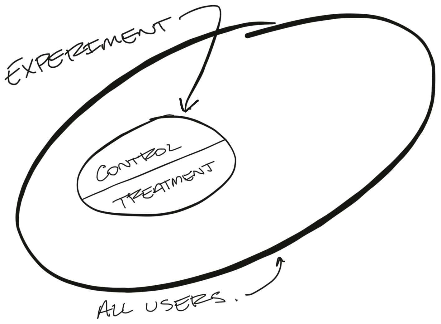
A controlled experiment is a tool to help us establish causation. We want to separate the effect our new feature has from all of the random noise that affects our metrics day-to-day. Because these experiments happened at the same time and the only difference between the two branches was our new feature, we know that any change in the results is caused by the addition of our feature.
This is still surprisingly difficult to do with Firefox. Getting a feature behind a pref (so we can switch it on and off remotely) adds a lot of complexity. Folks are understandably curious about why we're going through such a rigmarole.
Let's consider some simpler options (and why they don't actually work).
Why not just look at usage?
If we want to understand what effect our new feature has on usage, why not compare users that engage with our feature to users who don't?
For example, we recently launched improvements to Firefox's PDF Viewer. We're interested in knowing whether these improvements increased user retention. It seems obvious to start by comparing retention between users (1) who opened PDFs in Firefox and (2) users who did not open PDFs.
Here's what that might look like:
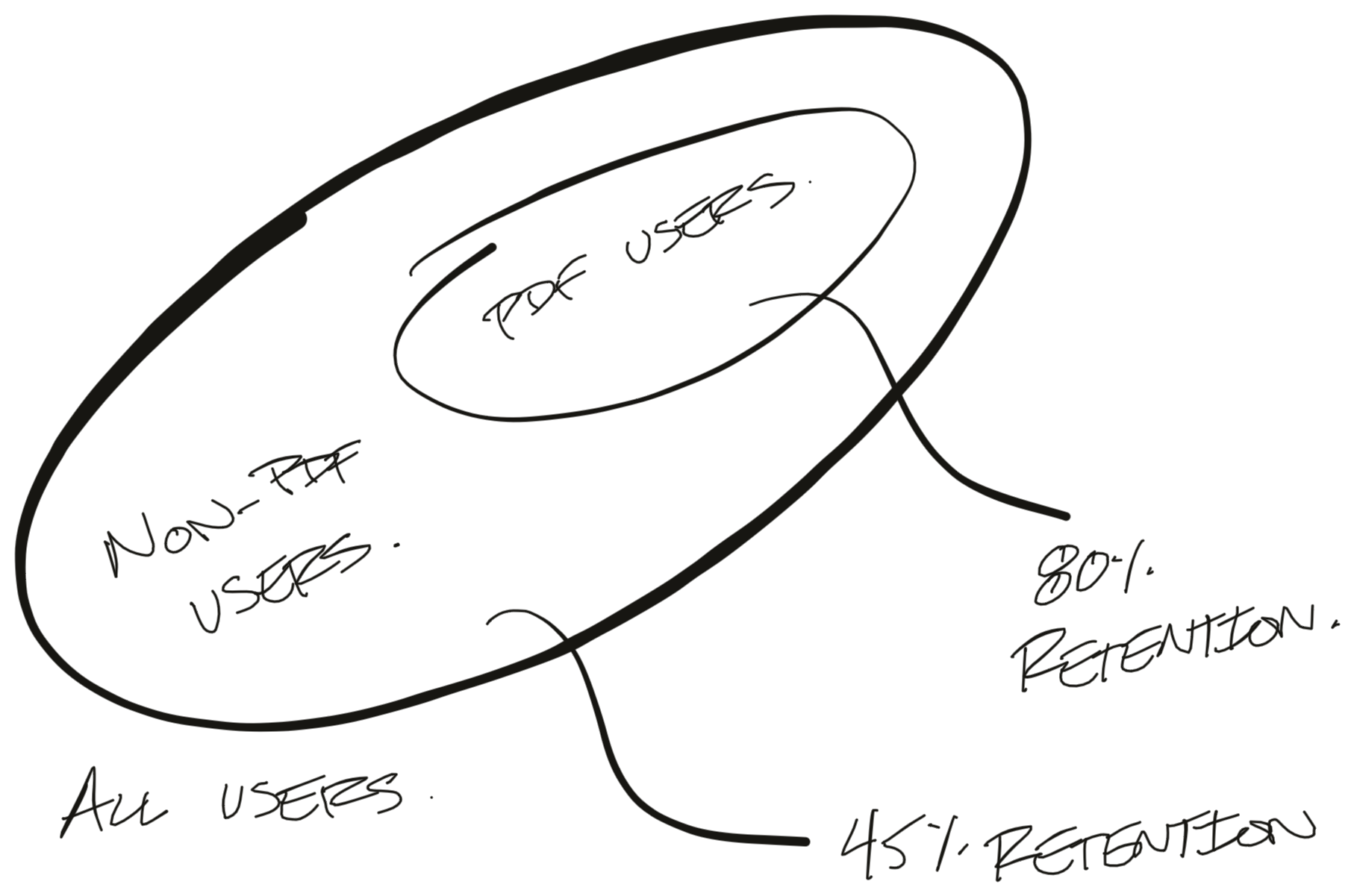
In this example we found that users who interacted with the PDF viewer retained at 80% week-over-week while non-PDF users only retained at 45%. That's a HUGE difference!
Unfortunately, this effect isn't real. As it turns out, "interacts with the PDF viewer" is a decent proxy for "uses Firefox a lot". Users who "use Firefox a lot" tend to retain well.
The critical problem here is that users get to self-select into one of the two groups. Active users tend to self-select into our "Uses PDF" group and inflate our results. This is the classic problem of correlation not meaning causation.
To drive this home, I ran a similar analysis for users who encounter errors when using Firefox. Errors are bad things, so we'd assume users who encounter errors would retain worse. The problem is, we find that users who encounter errors actually retain better than users who encounter no-errors. How can that be? Well, encountering an error is a good proxy for "Uses Firefox a lot". Users who don't use Firefox at all encounter no errors!
We need to find a better experiment.
What if we compare before and after the launch?
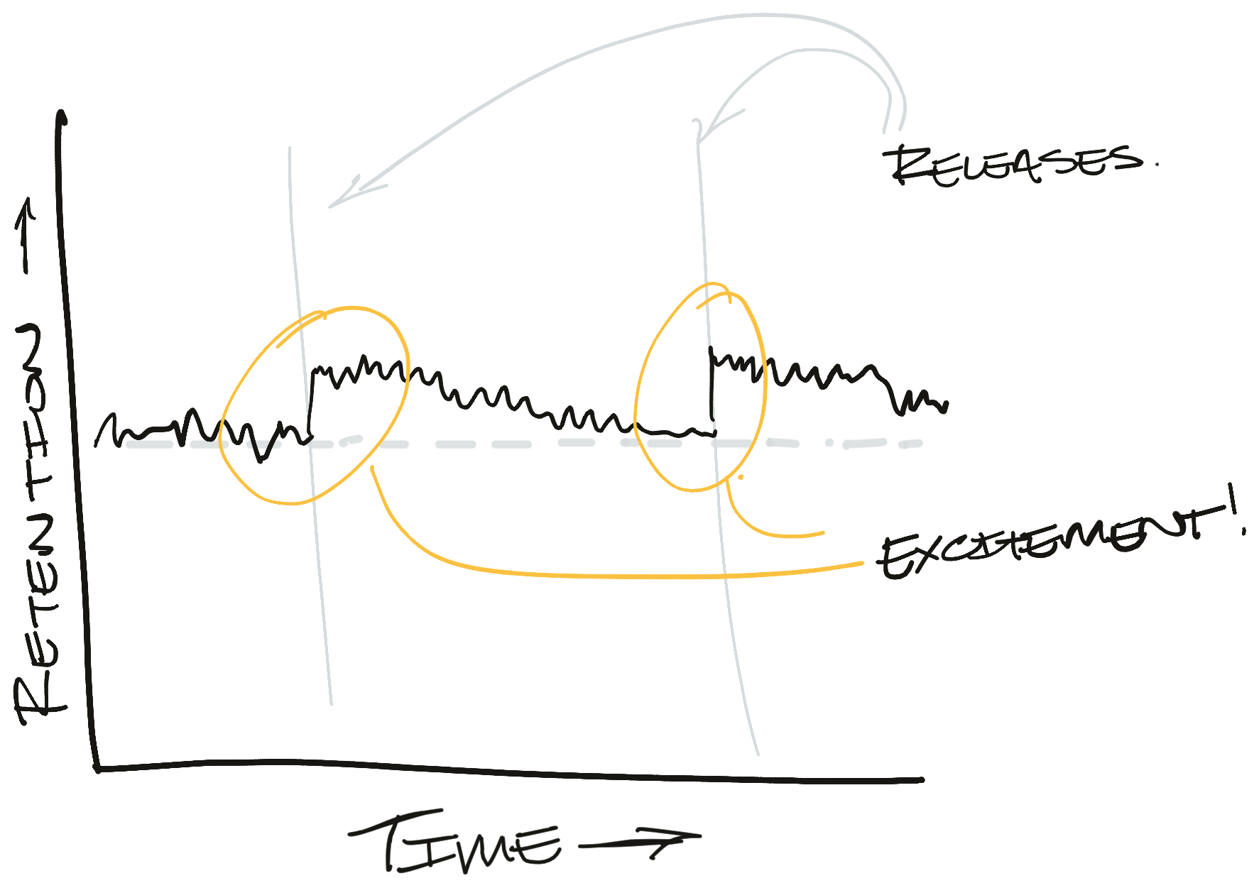
OK - so we can't compare active users to inactive users. What if we just launch the feature to 100% of our users and compare behavior before and after the launch? This way we're comparing roughly the same set of users just over different time periods.
If we monitor our retention metric over time, we hope to see a nice bump shortly after the launch. That graph might look something like this:
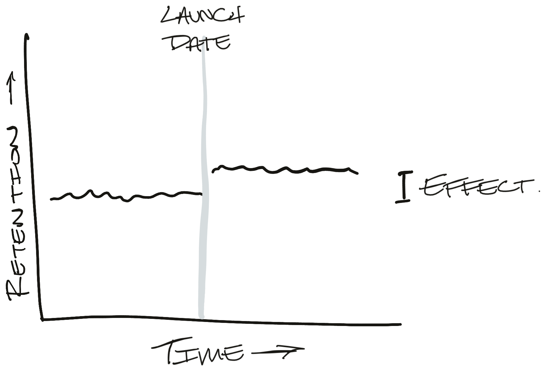
If we do see something like this, then it's pretty clear what effect our launch had. In reality, this is a very optimistic case. Seeing such a clear effect is the equivalent of being struck by lightning. It's a big effect and you know when it happens.
More often, our metric is much more volatile than this and our effect is much smaller. For context, Firefox New Profile retention regularly bounces between 35% and 40% within a week. In any one experiment, we would be thrilled with a 1%-point movement. Most metrics also have a strong seasonality. Our signal is dwarfed by the noise.
This means we're more likely to see a graph that looks like this:
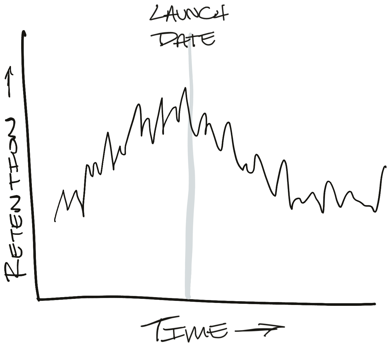
This graph creates a lot of new questions. It looks like retention is decreasing after the launch. Is that because of annual seasonality or did we break something? Let's look at year-over-year changes to adjust:
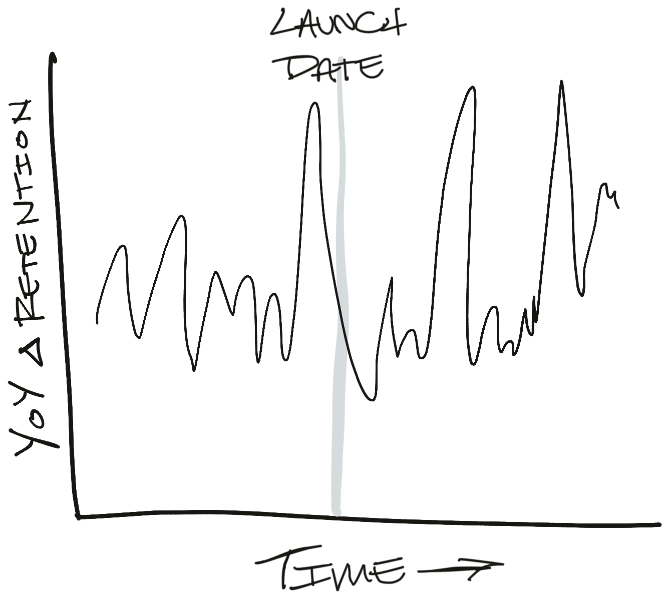
And on, and on, and on. This is the beginning of a long chain of what-if analyses that will take forever to resolve and leave us under-confident in our results. It's possible that we'll come to a resolution and find a real effect in the data, but we're just as likely to come up with a spurious correlation after slicing the data too many times (i.e. p-hacking or the green jelly bean problem).
What if we ran a controlled experiment instead? Well, then we'd get a graph like this:
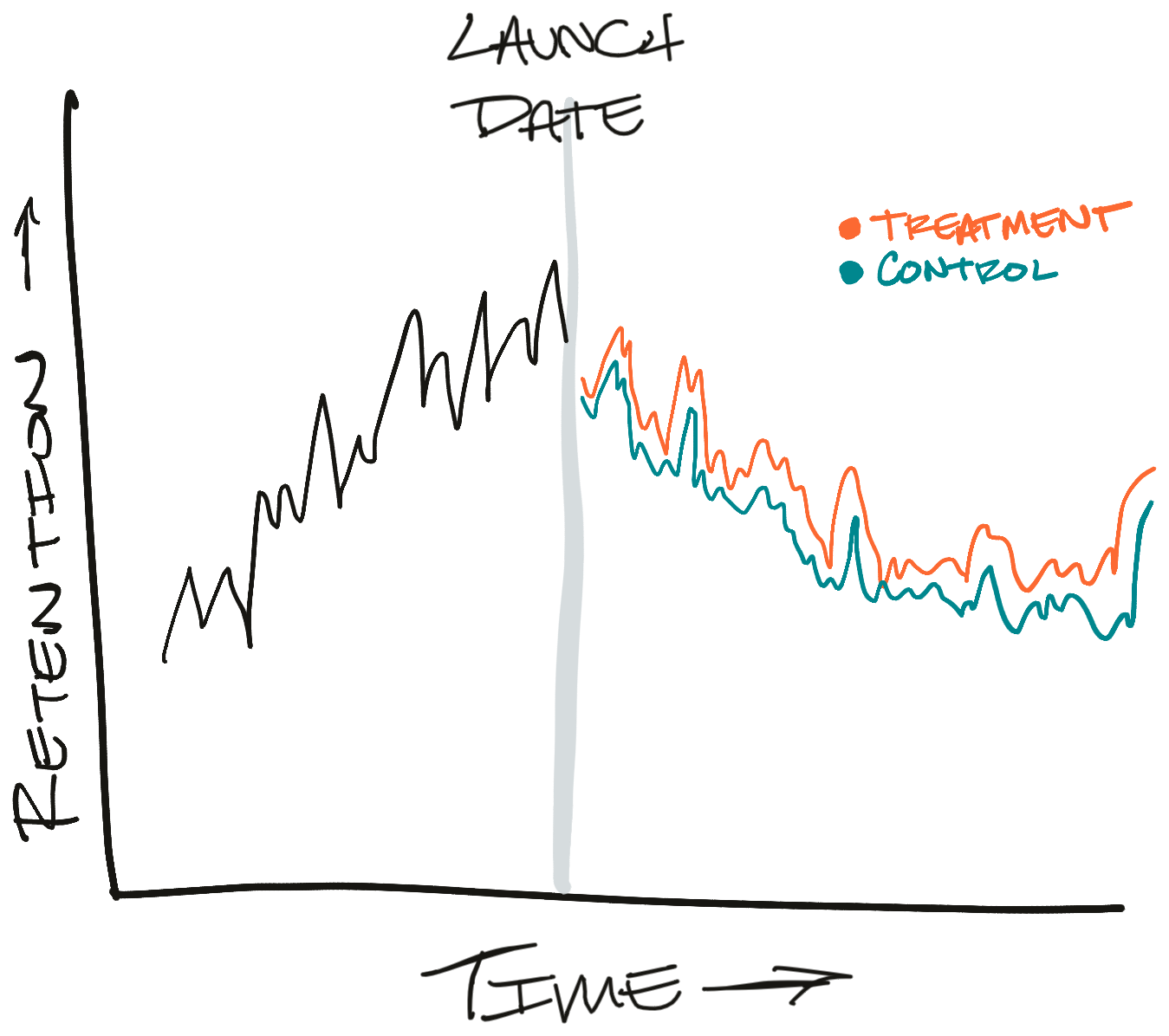
Now it's much clearer what's going on. We can clearly see that the treatment branch is doing better than the control branch. We see this even though there's plenty of noise and retention is declining overall. That's the benefit of having two branches running at once.
This is even more important for Firefox. It takes a while for Firefox releases to rollout - usually about a week. After that we need to wait a couple of weeks to be able to observe retention. That's a lot of time for the world to change under our feet. If something odd happens during that three-week-observation period, it will be very hard to separate our effect from the odd-event's effect. And here's a secret - there's always something odd going on.
OK, what if we throttle the rollout?
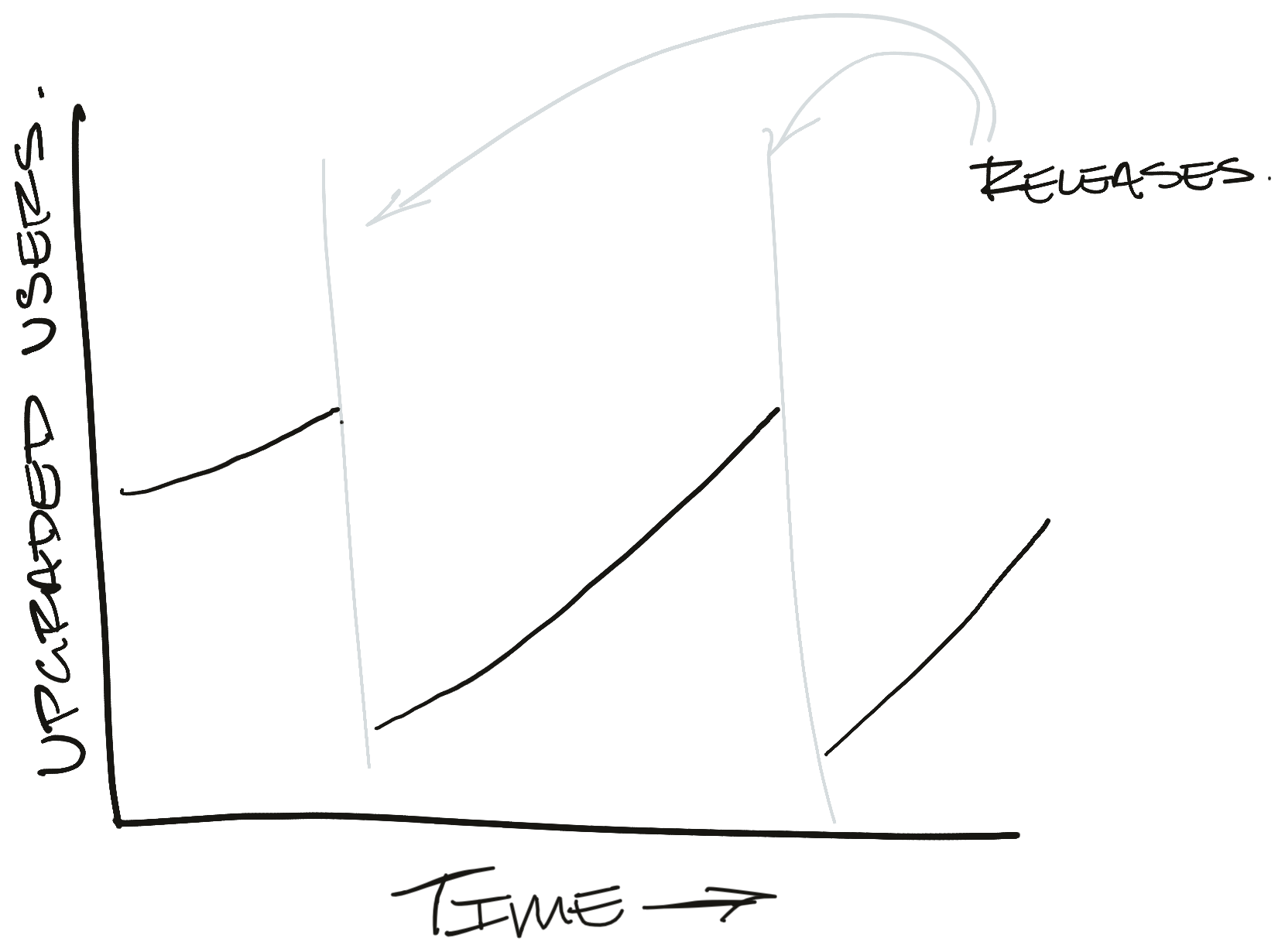
Instead of pushing the release to 100% of our users at once, we have the option of slowing the release so only a portion of our users can upgrade. Then we can compare upgraded users (treatment) to the users we held back from upgrading (control).
Here's what that might look like in the ideal case:
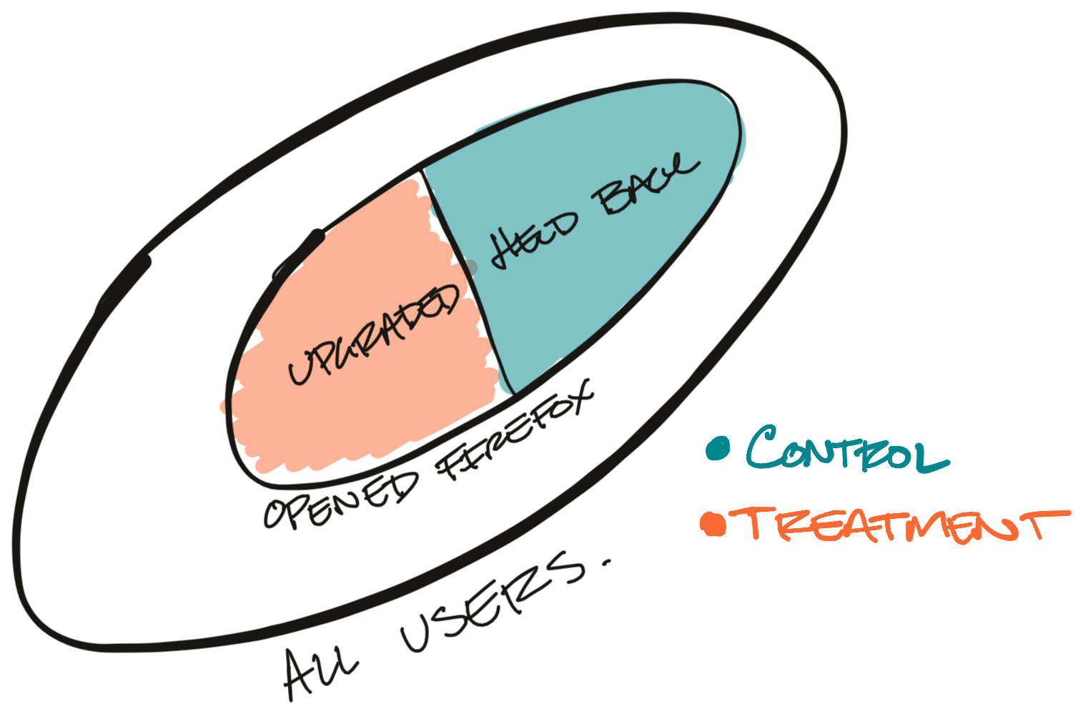
Since we're deciding whether the user gets to upgrade or not, we shouldn't have the self-selection bias we discussed above. Throttling the rollout is also simpler operationally because we don't need to remotely toggle features on and off.
This seems like a solid plan on the surface, and it would work for a lot of technology companies. Unfortunately, it doesn't work for Firefox.
For every Firefox release there's a portion of users who delay upgrading or never upgrade to the new version. Before Firefox can check for an update, the user needs to open their laptop and start Firefox. Unfortunately, we can't differentiate between inactive users and users who tried to upgrade and were held back. Effectively, a user needs to choose to use Firefox before they can be enrolled in the treatment branch.
Here's what the treatment and control branches actually end up looking like:
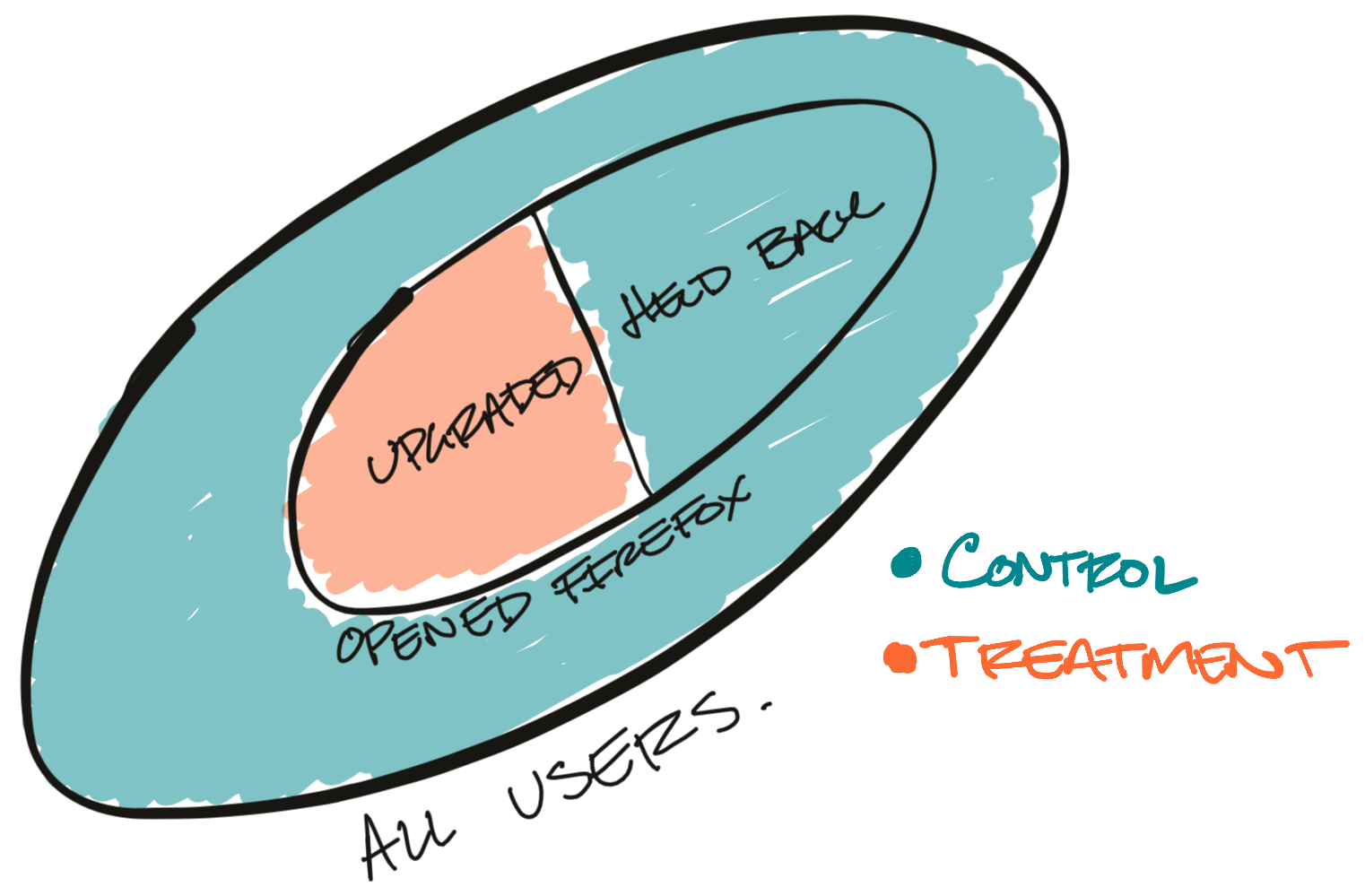
In this example, the inactive users who haven't opened Firefox overwhelm the held back users.
This subtle difference is enough to bias our results. It's an insidious little problem too because it stokes our ego. You see, in the first few days of every release we get a flurry of very active users who try to upgrade. For the first few days of the rollout these very active users are the only users who can join the treatment branch.
Since these users are super active our metrics look great! We can pop some champagne and celebrate releasing another great improvement to our user experience. As time goes on, the careful observer sees our metrics slowly revert to old levels. But, by then we're focused on the next big release.
Here's an example of what we might see if we looked at retention over time for users on the most recent version of Firefox:
If you look at the number of users on the most recent release version, this pattern starts to make sense:
If we were to treat this like an experiment, where users who upgraded are in "treatment" and users who haven't upgraded are in "control", we'd see something like this:
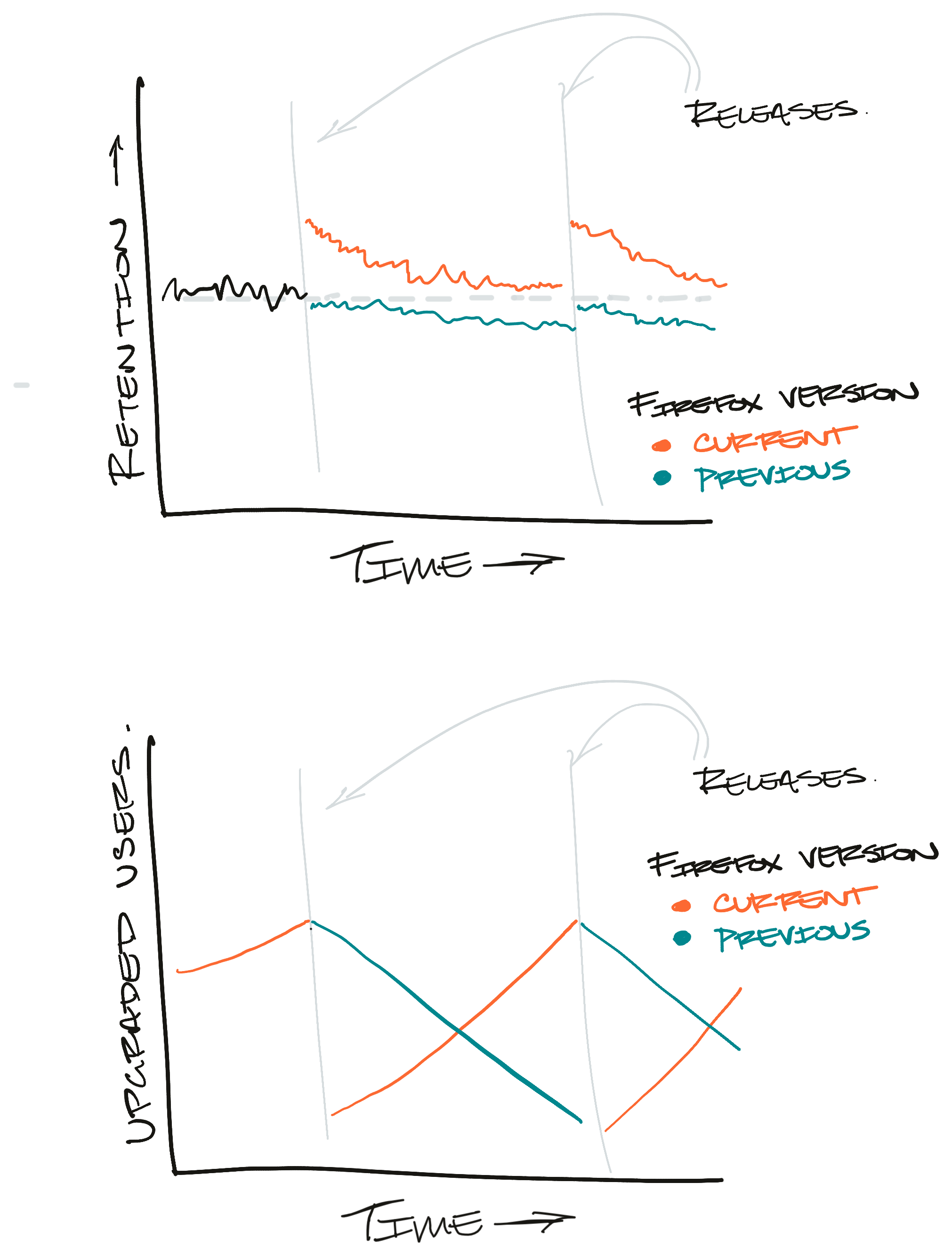
Again, the problem here is that there are few active users included in the "treatment" branch while "control" is weighted down by inactive users.
If we ran a real experiment, this is what we'd expect to see:
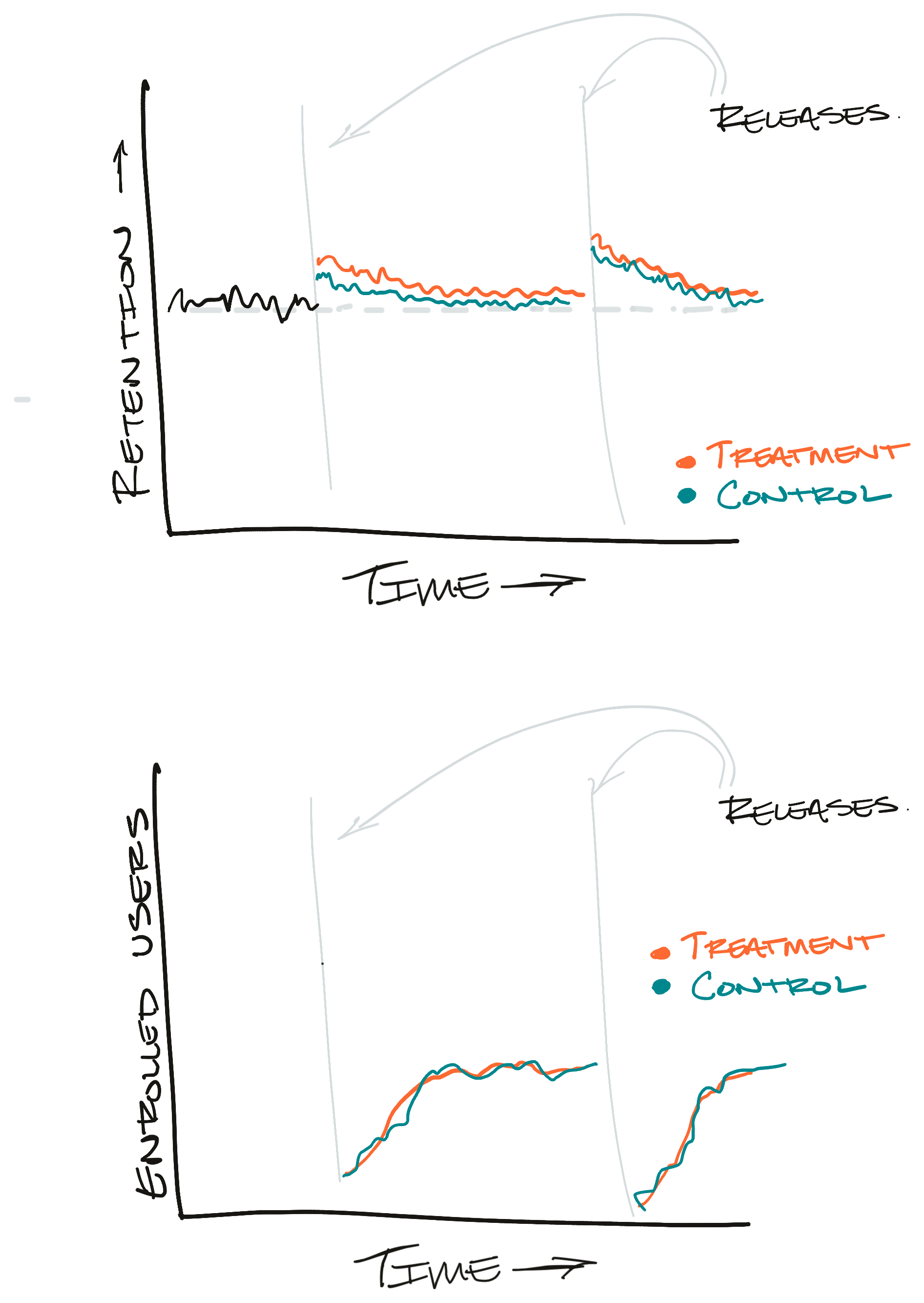
There's still an initial spike in the metrics, but it's reflected in both the control and treatment branches. We're also reassured by the user counts graph. Instead of moving in opposite directions like the throttled rollout, each branch has roughly the same number of users enrolled.
Conclusion
Don't let me kill your enthusiasm. There's still plenty of room for hold-my-beer kites-in-a-storm type experimentation, Especially early in a feature's lifecycle. But, if we want to be able to spot subtle changes to our products we need to run controlled experiments.
Hopefully these examples clarify why experimentation is so popular. At the very least I hope this article prevents others from making some of the mistakes I've made when trying to establish causation!
This article is part of a series I'm writing on building data intuition. In my next post I want to highlight some scenarios where uncontrolled experiments make more sense and how this all fits together in a feature's lifecycle.
I'd love feedback on what to write next. Shoot me an email if you have ideas!
Thanks to Dan McKinley and Audra Harter for reading drafts of this article